rebranding
pathways digital
Why a rebranding?
We believe our brand should feel current and true, but we discovered that our old image no longer reflected this well enough for us and our customers. So we brought together energy and in-house skills to create a fresh look and feel that reveals more and better conveys our ambition and direction as a brand.
Follow the process with us
In this section, we invite you to take a closer look at our rebranding journey and explore some of the changes we made. We crafted our new identity over 2.5 months. Here we share insights into our process and outcomes of this project
Lighthouse
100%
Performance
Score
100%
Accessibility
Score
100%
Best Practices
Score
100%
SEO
Score
How did we rebrand?
We started by asking decisive questions:
Who are we as a brand? Who is our customer and what value can we bring to their business and brand? What are we truly centered on? How can we position and express these insights? What should we keep from our old identity and what needs a fresh start?
Who are we as a brand? Who is our customer and what value can we bring to their business and brand? What are we truly centered on? How can we position and express these insights? What should we keep from our old identity and what needs a fresh start?
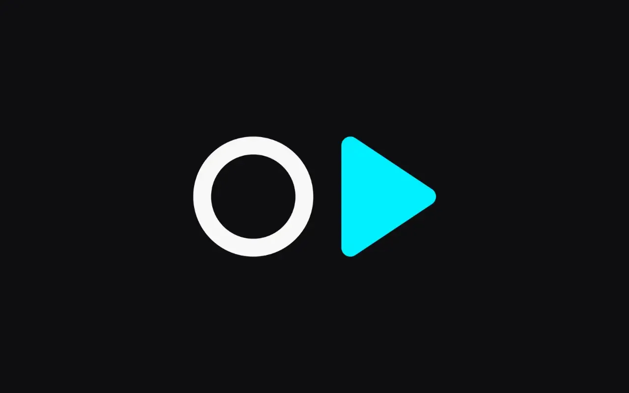
We changed the logo
Our new logo features a modern font with strong character and clear structure. Next to it, a minimalist icon draws attention: It combines a white ring and an electric blue triangle built around our brand initials p and d. The distinct form also echoes a play button and captures our main drive: to help you push play on your digital potential
New claim
push play on your digital potential
The thoughts behind our claim
We focus on technology and creative methods designed to support brands in scaling and performing digitally. That’s why our claim naturally revolves around digital potential. From the beginning, our vision was clear: “press play” wasn’t enough. It needed a "push" to capture the momentum and dynamics behind it
We have a new color concept
Electric blue and magenta are central to our color and light concept and stand out across our digital presence. We use neon tones as energetic, action-driven brand colors, balanced by subtle muted accents that add a sense of calm
And a new vibe overall
It’s more than just a new look. With micro animations, beams, glass surfaces and vibrant neon accents, we’ve created a light-driven atmosphere that guides focus and adds energy to the interface
It shows on our website
It introduces our updated visual language and brings more storytelling into focus. We tell it through value-based UX writing, playful imagery and slightly varied layouts. Our design mixes neon accents and glass effects in a dark mode that feels light and energy-aware. Microanimations accompany features and services along the way, while rotating 3D shapes reflect the idea of scale, adapt and perform
In a Nutshell: What did we keep?
1
deep focus on technology
2
symbolism involving light
3
our dynamic voice
4
our user centering and passion for innovation
and what has changed?
1
intensity and visuals
2
state of the art look and feel
3
sharper positioning and focus
4
enhanced digital presence